7.1 KiB
Graph
Sqliteviz allows building a graph. To build a graph, run a query to get data.
Then open the visualisation panel by clicking 

Requirements for result set
To build a graph, a result set must follow the following requirements:
- the first column must contain JSONs (the rest columns in the result set will be ignored)
- each JSON has a common key indicating if the record represents a node (value 0) or an edge (value 1)
- each JSON representing a node has a common key with a node id
- each JSON representing an edge has a common key with the edge source and a common key with the edge target
Each JSON can have more fields used for graph styling (read more in Graph styling).
Graph structure
Start building a graph by setting a mapping from your records to nodes and edge properties.
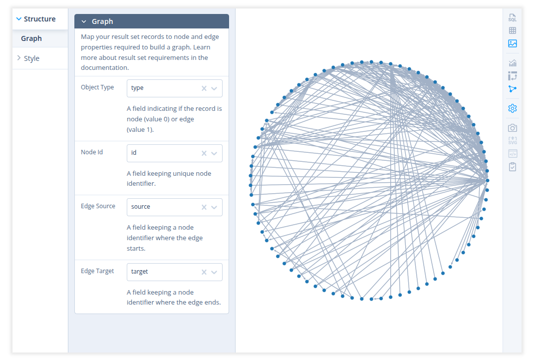
Go to Structure > Graph and set the following fields:
- Object type – a field containing 0 for node records and 1 for edge records.
- Node Id – a field containing the node identifier
- Edge source - a field keeping a node identifier where the edge starts.
- Edge target - a field keeping a node identifier where the edge ends.
This is already enough to build a graph with default styling and circular layout.
Graph styling
General
Set a background color of the graph in Style > General panel.
Nodes
There are the following settings in Style > Nodes panel:
-
Label - a field containing a node label. Note that if the graph has too many nodes, some labels can be visible only at a certain zoom level.
-
Label Color - a color of node labels
-
Size - set a node size. There are 3 modes of node sizing: constant, variable and calculated.
Constantmeans that all nodes have the same size.Variableallows you to choose a field where the node size will be taken.Calculatedallows to choose a method that will be used to calculate the node size. Currently, 3 methods are available: total node degree, degree by in-edges and degree by out-edges.For variable and calculated sizing it's also possible to set scale, the minimum size and the sizing mode - area or diameter. In the diameter mode the difference between node sizes will be more noticeable.
-
Color - set a node color. There are 3 modes of node color: constant, variable and calculated.
Constantmeans that all nodes have the same color.Variableallows you to choose a field by which the color will be determined. With this option you can also choose if the color value should be taken directly or mapped to a color palette.Directmode means that in JSON representing a node, the value available by the selected field will be used as a color. The color value in the JSON can be set in different ways:As Hex, 8-digit (RGBA) Hex
"#000"
"000"
"#369C"
"369C"
"#f0f0f6"
"f0f0f6"
"#f0f0f688"
"f0f0f688"
RGB, RGBA
"rgb (255, 0, 0)"
"rgb 255 0 0"
"rgba (255, 0, 0, .5)"
{ "r": 255, "g": 0, "b": 0 }
HSL, HSLA
"hsl(0, 100%, 50%)"
"hsla(0, 100%, 50%, .5)"
"hsl(0, 100%, 50%)"
"hsl 0 1.0 0.5"
{ "h": 0, "s": 1, "l": .5 }
HSV, HSVA
"hsv(0, 100%, 100%)"
"hsva(0, 100%, 100%, .5)"
"hsv (0 100% 100%)"
"hsv 0 1 1"
{ "h": 0, "s": 100, "v": 100 }
Named colors
Case insenstive names are accepted, using the list of colors in the CSS spec.
"RED"
"blanchedalmond"
"darkblue"
When
Map tooption is selected, the value by the selected field can be anything because it won't be used directly as a color. In this case each distinct value will be mapped to a certain color, so nodes with the same value will have the same color. Click on a color palette to open a palette selector.Calculatedcolor mode allows to choose a method that will be used to determine a color. Currently, 3 methods are available: total node degree, degree by in-edges and degree by out-edges. You can also choose a color palette that will be used in a mapping of calculated values into an actual color. -
Color As - defines how color mapping should work - continuously or categorically.
Continuous mode is more suitable when the mapped values have a meaningful order. It looks more informative with sequential palettes. In that case the lowest value corresponds to the first color in the palette and the highest value - to the last color. The color of each intermediate value reflects the position of that value in the range.
Categorical mode just uses the next color in the palette for each new distinct value.
-
Colorscale Direction - use a selected palette as is or reverse it.
Edges
There are the following settings in Style > Edges panel:
-
Direction - show an edges with or without arrows
-
Label - a field containing an edge label. Note that if the graph has too many edges, some labels can be visible only at a certain zoom level.
-
Label Color - a color of edge labels
-
Size - set an edge thickness. There are 2 modes of edge sizing: constant and variable.
Constantmeans that all edges have the same thickness.Variableallows you to choose a field where the edge size will be taken.For variable sizing it's also possible to set scale and the minimum size.
-
Color - set an edge color. There are 2 modes of edge color: constant and variable. They work similar to node color modes.
-
Color As - defines how color mapping should work - continuously or categorically, similar to the same node color setting.
-
Colorscale Direction - use a selected palette as is or reverse it.
Layout
Circular
In this layout all nodes are just placed along a circle.
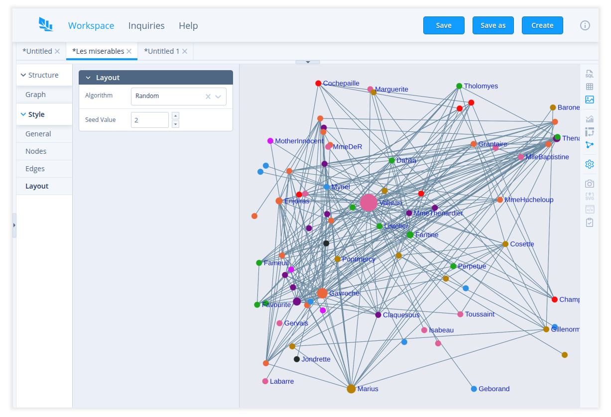
Random
This layout places nodes randomly for each seed value. The seed value allows you to restore the random layout you liked when you open the inquiry and run the query next time.
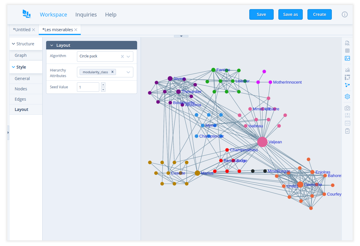
Circle pack
Arranges nodes as a bubble chart according to specified attributes. You can choose multiple hierarchy attributes used to group nodes.
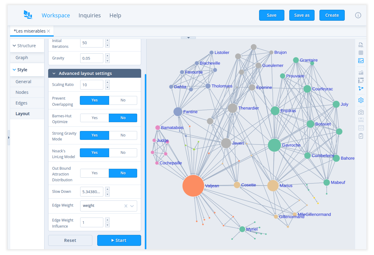
ForceAtlas2
A continuous graph layout algorithm. Read more details about the algorithm and its settings in the article.
The algorithm works in iterations. When you choose ForceAtlas2 layout or run the query, it will automatically run 50 iterations of the algorithm.
You can change the amount of steps run automatically in Initial Iterations.
You can also run and stop the algorithm manually by clicking Start/Stop button.
 How to build a pivot table in SQL(ite) explores two options with static
(or beforehand-known) and dynamic columns.


